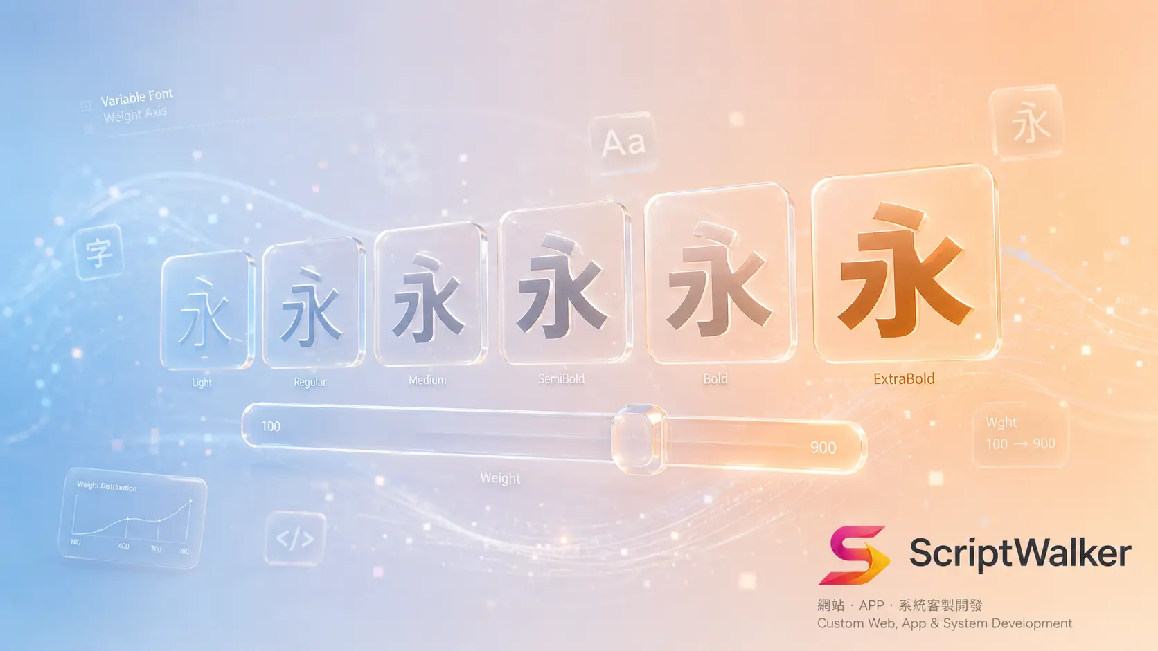
Opening: pick the wrong font and your site doesn't get ugly — it gets slow
Font choice for Traditional-Chinese sites is far trickier than for English, because a CJK font covering common Han characters is often several megabytes — hundreds of times larger than a full English family. In the Chinese context, font selection is not just an aesthetic question but a performance one: choose poorly, skip subsetting, and your carefully designed layout crawls on mobile and drives bounces. This piece covers 7 Traditional-Chinese font families worth considering, their commercial licensing, and the truth about variable-font file size.
Traditional-Chinese font cases worth studying
- Source Han Sans / Noto Sans TC (Adobe × Google open source): full weight range, open and commercial-friendly, the safe default for government and corporate sites — neutral and professional. Available on Google Fonts with a Variable Font version.
- Source Han Serif / Noto Serif TC: a serif for long-form reading and content media (magazines, journalism), conveying a literary, authoritative tone.
- Taipei Sans TC: derived from open-source Huninn, free for commercial use, rounded and friendly — good for approachable and education brands.
- jf open Huninn: an open-source handwritten rounded face, playful — common for cultural-creative, F&B, and kids' brands.
- justfont Jinxuan (paid commercial): an elegant body face between sans and serif, favored by premium brand sites — requires a license.
The logic behind the design
A typeface is the first signal of brand voice. Typography research broadly agrees that weight, width, and stroke style shape a reader's first impression of professional vs friendly, authoritative vs playful — often before they've read a single word. Sans reads modern, clean, neutral; rounded reads approachable and low-pressure; serif reads traditional, trustworthy, good for long reading. The right question isn't which font looks nice, but what do I want a visitor to feel in half a second. A typeface aligned with brand tone lowers cognitive friction.
Technical cost and limits
This is the most overlooked yet most performance-damaging part of Chinese font choice. A full CJK font (tens of thousands of glyphs) commonly lands at 5–16MB; even a Variable Font folding multiple weights into one file stays sizable. Loaded whole, fonts become an LCP killer. The fix is subsetting — packaging only the glyphs a page actually uses, cutting size from several MB to tens or hundreds of KB. In practice, follow web.dev font best practices: font-display: swap to hold layout with system fonts, preload key fonts, and compress to WOFF2. A Variable Font's benefit is one file for many weights, saving requests — but for CJK it still only pays off with subsetting.
Which industries it fits vs doesn't
| Font style | Fits | Doesn't fit |
|---|---|---|
| Sans (Source Han Sans) | Tech, finance, corporate sites, admin systems | Craft shops wanting a warm, handmade feel |
| Rounded (Taipei Sans / Huninn) | Education, family, F&B, cultural-creative brands | Law and medical needing serious authority |
| Serif (Source Han Serif) | Content media, long reading, premium storytelling | Dense small-text UI and mobile interfaces |
How to apply it to your site (5 steps)
- Step 1 — Set the tone: decide the first impression (professional/friendly/authoritative), then pick a style.
- Step 2 — Choose 1–2 families: at most two (headline + body) to avoid clashing; prefer open, commercial-friendly fonts to cut license risk.
- Step 3 — Subset: package only the glyphs you use and output WOFF2.
- Step 4 — Set loading strategy:
font-display: swap+preloadkey fonts to avoid layout shift and LCP damage. - Step 5 — Measure: verify with Lighthouse / Core Web Vitals that fonts aren't slowing load.
Common mistakes and how to avoid them
- Loading whole fonts without subsetting: first paint stalls for seconds. Avoid: always subset + WOFF2.
- Three+ fonts on one page: visual noise and extra requests. Avoid: at most two (headline + body).
- Using a paid font without checking the license: commercial claims later. Avoid: prefer open fonts; confirm web-use scope for paid ones.
Further resources
- Google Fonts — Noto Sans TC: free Source Han Sans and its Variable Font.
- Fontsource (@fontsource-variable/noto-sans-tc): npm package for self-hosting the Variable Font.
- web.dev — Font best practices: official guide to font loading and performance.
FAQ
Which font is the safest bet for a Traditional-Chinese site?
If unsure, Source Han Sans (Noto Sans TC) is safest: open and commercial-friendly, full weight range, neutral and professional, and easy to get via Google Fonts or self-hosting. Swap in a more distinctive face once brand tone is clear.
Is a Variable Font always more efficient?
Not necessarily. Its strength is one file for many weights, cutting requests; but for CJK the file itself is still large and only pays off with subsetting. Efficiency comes from whether you subset, not from whether it's variable.
Can free fonts be used commercially?
Source Han Sans, Taipei Sans, and jf open Huninn use open licenses and are generally commercial-friendly, but read each license; fonts like Jinxuan require paid licensing — confirm web-use scope before use.
Fonts are slowing my site — what's the fastest fix?
Three quick wins: subset to only used glyphs, convert to WOFF2, and add font-display: swap with preload. Together these usually turn fonts from an LCP bottleneck into an unnoticed load.
Sources
- web.dev: Best practices for fonts (subsetting and loading strategy)
- Google Fonts: Noto Sans TC (weights and Variable Font info)
Call to action
Want typography that matches your brand tone without slowing the site? ScriptWalker offers integrated brand-visual and web-performance work — from font selection and subsetting to Core Web Vitals optimization. Free consultation welcome.
- Email: [email protected]
- Phone: 0916-224-047
- LINE: @ufv9089p