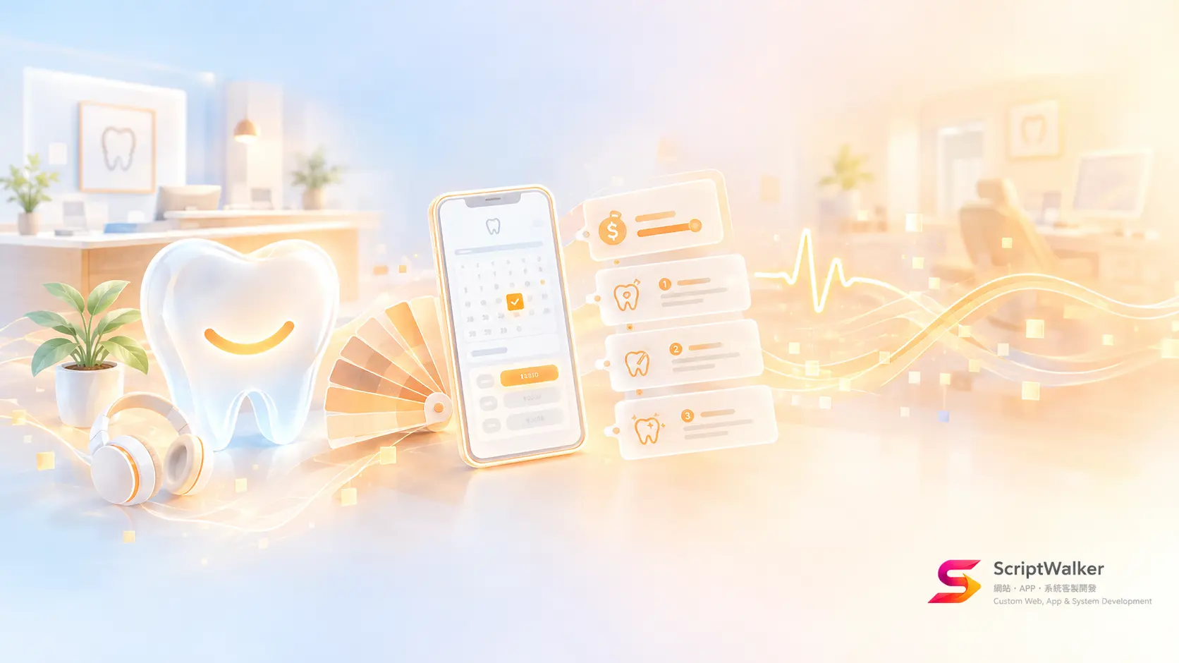
Short answer: A dental clinic website should lower anxiety before it proves expertise: roughly 1 in 8 adults has high dental fear. Warm neutral colors, real photos of the clinic, and prices plus booking visible on the first screen are the cheapest anxiety-reducing moves, and a redesign takes about 3–6 weeks.
Why dental websites need to deal with fear first
Bottom line: dental sites rarely lose patients for looking unprofessional; they lose them by reminding people of the dentist's chair. A systematic review and meta-analysis by Silveira et al. (Journal of Dentistry, 2021) puts dental fear and anxiety at about 15.3% of adults, with high fear at about 12.4%. These people postpone, and the website is often where they decide whether to call. Yet most clinic sites still use white backgrounds, blue-green palettes and close-ups of instruments, which reminds them of the fear right before booking.
4 real cases: what they replaced
Bottom line: the strongest dental brands replace a "hospital" feel with a "living space" feel, and they use the same palette online and in the clinic.
| Brand (location) | Design choices | Problem it addresses |
|---|---|---|
| Tend (New York, US) | Warm muted palette, rounded forms, honey-colored cabinetry; headphones with nature documentaries in the chair | Takes cues from boutique hotels, not hospitals |
| Surbiton Smile Centre (London, UK) | Warm orange and yellow for a coffee-bar atmosphere; modular logo built for more locations | Moves away from the cold clinical feel |
| Dr. Scherble dental practice (Germany) | Sand tones instead of the usual blue-green, a plain sans-serif typeface and light-filled photography | Second generation taking over; needs to feel warm and current |
| Clinique dentaire Geneviève Lafrance (Canada) | Soft, mature palette, a smile-curve logo, glass partitions patterned with large circles | Signals professionalism, comfort and attentiveness at once |
The logic behind the design
Bottom line: reducing anxiety means fewer threat cues and more predictability; color is only one part of it.
- Remove triggers: needles, drills and open-mouth close-ups are what anxious patients react to most. Keep them off the first screen.
- Predictability: fear largely comes from not knowing what will happen. Clear steps, durations and price ranges calm people more than adjectives.
- Real people: genuine photos of the dentists build more trust than stock models.
- Warm neutrals: sand, off-white and light wood read as home, distancing the site from the white-and-blue hospital memory.
Technical cost and limits
Bottom line: the look itself is cheap; the real costs are photography, image performance and content work.
- Hours: color tokens and component updates take about 16–24 hours; a full redesign including booking takes about 3–6 weeks.
- Photography: a half-day shoot of the clinic and team is the line item most often left out of budgets.
- Performance: large hero images are the most common LCP culprit; keep LCP under 2.5 seconds by converting the hero to AVIF/WebP, keeping it under 200KB and preloading it.
- SEO: publish prices and treatment details as text, not images, so search engines and AI summaries can read them.
- Accessibility: muted palettes easily fail contrast; body text must meet WCAG 4.5:1.
Good fit vs poor fit
Bottom line: general, pediatric and elective-treatment practices fit best; clinics built on emergencies or low prices need adjustments.
| Good fit | Poor fit (or needs adjusting) |
|---|---|
| Family and neighborhood dentists | Emergency clinics: phone number and map come first |
| Pediatric dentistry: warm colors plus illustration work even better | Budget chains: warm neutrals can read as expensive |
| Implants, orthodontics and other elective treatments | Hospital dental departments: must follow the hospital identity |
How to apply it to your site: 5 steps
Bottom line: audit the triggers, then change colors and photos, then shorten the booking flow.
- Audit trigger images: remove instrument, needle and open-mouth close-ups from the home and treatment pages.
- Define a warm neutral palette: make sand or light wood the primary color, demote blue-green to an accent, and store it as design tokens.
- Shoot the real clinic and team: natural light, visible faces, reception and waiting area first.
- Add predictable information: each treatment page lists the steps, duration and price range.
- Shorten booking: put "Book online" and "Ask on LINE" on the first screen and keep the form to 4 fields.
Common mistakes and how to avoid them
Bottom line: the most common mistakes are breaking medical advertising rules and sacrificing readability for warmth.
- Before/after photos as promotion: under Taiwan's Medical Care Act and health ministry rulings, before/after comparisons used outside health education count as improper medical advertising (summary by Lee and Li). Use process diagrams on the home page and in ads.
- Light text on light backgrounds: it looks soft but is hard to read, and older patients leave first.
- Words like "painless" or "guaranteed": overclaiming risks violations and lowers credibility.
Further resources
Bottom line: 4 free tools cover palette, contrast and image optimization.
- Coolors: generate warm neutral palettes quickly.
- WebAIM Contrast Checker: check text contrast.
- Noto Sans TC: a commercially usable Traditional Chinese sans-serif.
- Squoosh: convert clinic photos to AVIF/WebP.
FAQ
Does a dental website have to be blue or green?
No. Keep blue-green as an accent and use sand or off-white as the main color to stand apart.
Can the website show before/after photos of implants or braces?
Not as promotion in Taiwan; outside health education they count as improper advertising. Use diagrams and text.
How long does a dental website redesign take?
About 3 weeks for palette and photos; 4–6 weeks with rewritten treatment pages and online booking.
Do warm neutrals suit pediatric dentistry?
Yes, with higher saturation and some illustration so children and parents both feel welcome.
Call to action
Bottom line: send us your clinic's URL to find out how many "scary" signals it has. ScriptWalker (a Taiwan-based Laravel/Flutter custom development studio) will flag first-screen trigger images, low-contrast text and LCP problems for free, and rank the fixes in order.
- Email: [email protected]
- Phone: 0916-224-047
- LINE: @ufv9089p