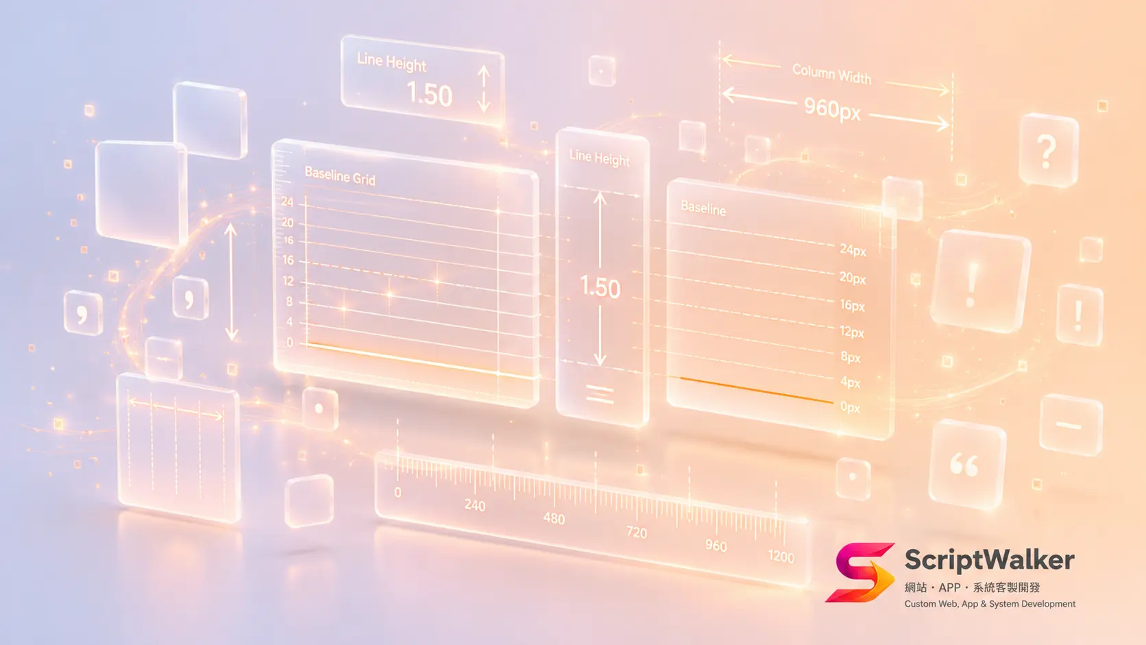
When an English template gets reused for Traditional Chinese, the problem is rarely an ugly typeface. It is that nobody changed the layout parameters: line-height still sits at 1.5, the measure has no upper bound, Latin characters and digits collide with Chinese glyphs, and runs of full-width punctuation blow open holes in the text. None of that is fixed by swapping fonts. In 2026, browsers have finally shipped text-spacing-trim, text-autospace and text-wrap — properties designed for East Asian text — so Chinese typography can be specified in CSS and, more importantly, signed off in an acceptance checklist.
How real sites handle it
The Reporter and CommonWealth Magazine optimise for long-form reading: generous line spacing, a deliberately narrow body column that keeps lines in the low-to-mid thirties in characters, and paragraph gaps clearly larger than the leading, so readers get a real pause between blocks.
Apple Taiwan is the reference case for mixed scripts. Product names, spec numbers and Chinese copy alternate constantly; headings run tighter tracking while body copy runs looser leading, and there is visible breathing room between Chinese and Latin, and between numbers and units.
PChome 24h and momo go the other way: tight leading, headings that truncate or break awkwardly, trading comfort for scan speed. That is not a mistake — it is a different task.
The cautionary examples are easy to find. Notion's Chinese UI and GitHub's Chinese docs were laid out for English, so Chinese inherits cramped leading and zero spacing around Latin words. Chinese Wikipedia on a wide monitor shows the same family of problem in its unbounded line length.
Why Chinese needs different numbers
Chinese is written in square glyphs with no spaces between words. English gets free scanning pauses from word spaces; Chinese does not. At identical line-height, a Chinese paragraph is visually denser, so it needs more leading before lines separate cleanly.
The cap on characters per line comes from the return sweep. When a line is too long, the eye mis-targets the next line's start and the reader re-reads. That is eye-movement behaviour, not an aesthetic preference.
Chinese also has no x-height contrast and almost no ascender or descender variation, so a paragraph reads as an even grey slab with no silhouette. Rhythm has to come from paragraph spacing and subheadings. Punctuation occupies a full-width box, so consecutive marks open large gaps — precisely what W3C CLREQ (Requirements for Chinese Text Layout) documents at length.
Cost and constraints
text-spacing-trim ships in Chrome and Safari but not Firefox, and is not yet Baseline, so the degraded rendering must still be readable (see MDN). text-autospace has been supported since Safari 18.4 with other engines in progress; Chrome for Developers has the full rundown. text-wrap: balance is better supported but most implementations only handle roughly six lines, so long paragraphs are untouched.
On effort: a complete spec plus site-wide rollout and cross-browser verification runs about 8–20 person-hours; tokenising it into a design system and aligning with Figma adds up to roughly 24–40. Pure CSS parameters cost essentially nothing in bytes (under 1KB). What actually hurts LCP is the font file — a single Chinese weight is commonly 3–8MB, so loading an extra weight for typographic reasons is the real expense. Typography is not a ranking factor, but readability shows up in dwell time and scroll depth. Also, injecting spacer span elements to fake mixed-script spacing pollutes the plain-text content and leaves stray whitespace when AI systems scrape the page. Solve it in CSS first.
Where it is worth the investment
| Worth it | Not worth it |
|---|---|
| Long-form media, knowledge bases, technical docs | E-commerce listing and search pages |
| Law, accounting and consulting firms | Admin back offices |
| Brand sites and education | Dashboards and reports |
| Long reading sessions, trust-building | Density first — tighten leading for scanning |
The test is simple: are users reading or looking? Reading wants space; looking wants density.
A spec you can sign off
| Item | Target |
|---|---|
| Body line-height | 1.7–1.8 unitless (e.g. 1.75), never inherit 1.5 |
| Heading line-height | 1.2–1.35 |
| Measure | 30–40 Chinese characters, around max-width: 38em |
| Paragraph gap | At least 1.5× the leading (1.75 implies 1.2em or more) |
| Mixed-script spacing | About 0.25em, ideally via text-autospace |
| Body size | 17px+ on desktop, 16px+ on mobile |
| Letter-spacing | Body 0 to 0.02em; headings up to 0.05em |
| Punctuation | text-spacing-trim for consecutive marks |
| Line breaking | line-break: strict with word-break: normal |
| Orphans | text-wrap: balance on headings, pretty on body |
| Justification | Allowed only with pretty; otherwise stay left-aligned |
| Bold | Avoid synthetic bold; use a real 700 weight, size or colour |
How to apply it
- ☐ Measure first — inspect body line-height and max-width in DevTools; most templates still hold English defaults
- ☐ Define four variables: --lh-body: 1.75, --lh-heading: 1.3, --measure: 38em, --gap-para: 1.2em
- ☐ Apply to one page only, compare side by side, then roll out
- ☐ Layer on text-spacing-trim, text-autospace and text-wrap, and confirm the Firefox fallback still reads well
- ☐ Handle mixed-script spacing in CSS first, editorial guidelines second, backend insertion last
- ☐ Test with your longest real heading and longest real paragraph, never Lorem Ipsum
- ☐ Verify at 375px, 768px and 1440px
Common mistakes
- Keeping line-height: 1.5 from an English template — move body copy to 1.7–1.8.
- Adding letter-spacing: 0.1em to Chinese body copy to look refined — Chinese is already monospaced by nature, and extra tracking only slows reading. Save it for headings or all-caps Latin.
- Breaking headings manually with br — it collapses on the next breakpoint; use text-wrap: balance.
- Justifying everything — Chinese justification produces irregular gaps; pair it with text-wrap: pretty or stay left-aligned.
- Faking hierarchy with synthetic bold — strokes blur; use a real weight, a size step or colour.
Further reading
- W3C CLREQ — the authoritative reference for Chinese text layout, covering leading, punctuation and line-breaking rules.
- MDN text-autospace and MDN text-wrap — syntax and current support for mixed-script spacing and wrap control.
- Chrome for Developers: four new international CSS features — worked examples your front-end team can adopt directly.
FAQ
Does 1.75 make pages uncomfortably long?
Pages do get longer, but scrolling costs far less than re-reading. If you must compress, narrow the measure before lowering leading, and never drop below 1.5.
Can CSS alone handle mixed-script spacing without CMS access?
Yes. Safari already supports text-autospace; other browsers simply omit the 0.25em for now, which neither breaks the layout nor hurts readability.
Do we need a new typeface?
Fix the parameters first — most of the crowding disappears. A font change is only mandatory when you need a genuine 700 weight, and it must be weighed against file size.
Does measure matter on mobile?
Width is naturally constrained there. The real risks are body text below 16px and side padding eating the readable width.
What counts as passing?
At all three widths: no orphaned characters in headings, no punctuation at line starts, no line over 40 characters, and visible pauses between paragraphs.
Put this spec into your project
ScriptWalker handles design and development together, so we can turn this spec into design-system tokens and ship it into your Laravel, Vue/Nuxt or Flutter project, with a cross-browser acceptance checklist attached. If you want to know where your current site stands, send us the URL and we will return a concrete parameter comparison.
- Email:[email protected]
- 電話:0916-224-047
- LINE:@ufv9089p