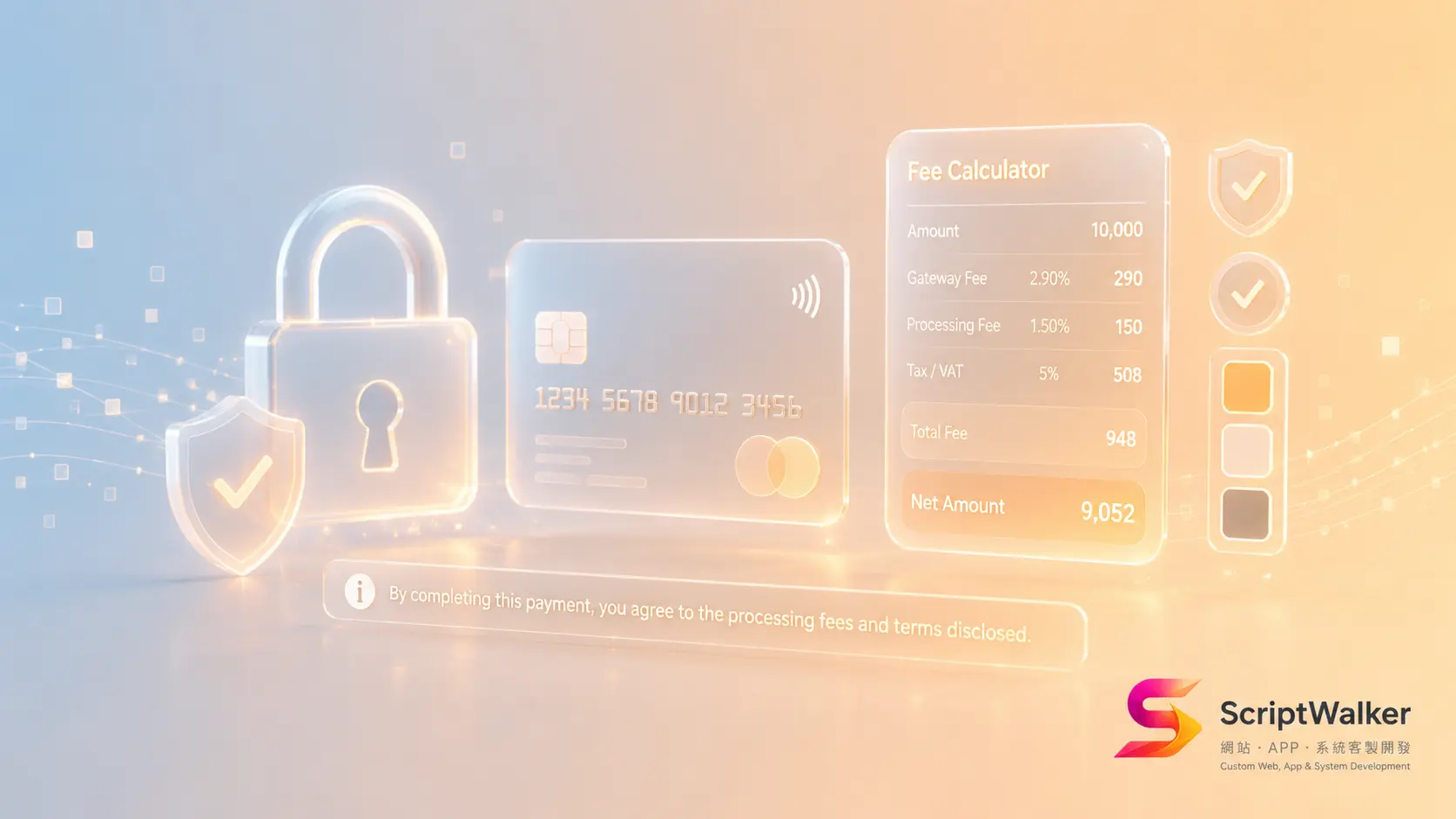
The harder you try to look safe, the more you look like 2012
For two decades the answer to "make the finance site look trustworthy" was navy blue, a glass office tower and a stock handshake. In 2026 that set works against you: it reads as old and slow at once. Swinging the other way costs too — people will use a consumer-app-looking interface to check a balance, then hesitate to attach a new card or finish an insurance application in it.
Fintech, insurance and lending are among the few sectors where trust and conversion actively subtract from each other. Add a badge, bounce rate drops but the form gets longer. Ship a custom typeface, brand recall goes up along with load time. Below: what five real brands do, and the bill attached to each choice.
Five real examples, and what they actually changed
- Wise (cross-border transfers) — the 2023 rebrand with Ragged Edge moved the core colour from blue to green, split one-dark-one-bright: deep forest green (#163300) carries text, navigation and dark sections, electric lime (#9fe870) is reserved for CTAs and key figures. The real trust device, though, is the homepage fee calculator — fee, exchange rate and amount received laid out at step one rather than buried in terms. Type moved to Wise Sans, a custom face covering 342 languages.
- Stripe (payments infrastructure) — the homepage runs a real-time animated gradient as its hero, arguing technical capability rather than promising safety. The rest of the page is a neutral grotesk (Söhne) plus a logo wall of Amazon, Shopify and Salesforce with scale metrics. Mercury, Brex and Ramp ship variations on the same system, producing a recognisable "financial infrastructure" face.
- Nubank (Brazilian neobank) — purple (locals call it roxinho) cut straight through a category drowning in blue. The more instructive part is the Nu Brand System and its illustration library: NuIS 3.0 deliberately moved from cartoonish to clean-line and grown-up, with the organising idea named outright as "Transparency Matters" across 150+ illustrations.
- Lemonade (US property insurance) — minimal black line art, pink reserved almost entirely for CTAs, and quoting plus claims rebuilt as conversational flows (Maya for onboarding, Jim for claims), breaking intimidating field sets into one question at a time.
- Taishin Richart / Cathay United CUBE (Taiwan) — Richart entered digital banking with youth-coded language and gamified campaigns, taking a Red Dot award in its first year. CUBE went the other way: heavy white space, low saturation, restrained block layering — stability signalled through density rather than colour. Same market, two valid faces of "safe".
Why it works: people guess at security from appearance
Stanford's Persuasive Technology Lab, directed by B.J. Fogg, ran credibility studies across more than 5,500 participants and found 46.1% of users judged a site's credibility partly on overall visual design — layout, typography, type size, colour. That outweighed the actual security information on the page.
Baymard Institute's checkout work supplies the other half. Users have little grasp of a page's real technical security and go on gut feel; when card fields are encapsulated with a distinct background or border, perceived security rises measurably. Roughly 19% of online shoppers have abandoned a checkout because they did not trust the site with their card details.
The moderating variable is fame. The better known the brand, the fewer visual security cues it needs; badges next to payment fields move the needle most for brands nobody has heard of. Stripe does not need an SSL seal; your site probably does.
What these signals actually cost
Trust signals show up on the performance report and the timesheet.
- Custom typefaces. A face covering Traditional Chinese commonly lands at 1–3 MB even after subsetting. Without font-display: swap and preload it pushes you past the 2.5-second "good" LCP threshold. CJK projects need dynamic subsetting, not the European playbook copied wholesale.
- Animated gradient heroes. Canvas/WebGL gradients occupy the main thread on mid-range Android and hurt INP. Ship a static fallback and honour prefers-reduced-motion.
- Regulated real estate. Taiwan's FSC circulated rules for credit card and cash card online advertising requiring image ads to carry the warning across one-thirteenth of the layout at no smaller than 14-point type. That band belongs in the design file, not bolted on before launch.
- Contrast and accessibility. Monetary figures must clear WCAG 2.2's 4.5:1 text contrast; buttons, inputs and focus indicators need 3:1. Pale-grey-on-pale-grey "premium" is a compliance risk here.
- Hours. On a small-to-mid project the full trust layer — calculator, status treatments, disclosure system, contrast audit — typically adds 25–40 hours of design plus front-end work.
Good fit vs poor fit
| Works well for | Poor fit / needs heavy adaptation |
|---|---|
| Digital accounts, e-wallets, remittance | Luxury retail (needs desire, not rational transparency) |
| Insurance, retirement and wealth platforms | Restaurants and travel (excess calm kills appetite) |
| B2B payment APIs and subscription billing | Creative studios and galleries (neutral = undifferentiated) |
| Lending, instalments, invoice financing | Children's products and games |
| Anything that must disclose fees or risk, incl. private-pay healthcare | Pure brand microsites with no transaction path |
How to apply it to your site: six steps
- Step 1: Inventory what you ask users to hand over. List every point demanding money, a national ID, an account number or an authorisation. Those pages need trust work; the rest do not.
- Step 2: Split colour 90/10. One dark structural colour carries roughly 90% of the surface. One saturated colour appears only on CTAs and key figures. Saturation everywhere reads as a promotion, not a financial product.
- Step 3: Move rates and conditions forward. Copy Wise: put fees, rates and exclusions into a calculator or explicit table at step one, not the FAQ. Transparency is the cheapest trust signal available.
- Step 4: Visually encapsulate money inputs. Give card number, amount and identity fields their own background or border, add a lock icon and one plain line ("transmitted over TLS"), and confirm the focus indicator hits 3:1 contrast.
- Step 5: Standardise number formatting. Tabular figures, fixed decimals, thousands separators. Never signal negatives with colour alone — add a minus sign or parentheses. Misaligned digits damage trust faster than an ugly palette.
- Step 6: Measure before launch. Lighthouse for mobile LCP, a contrast checker across every figure and button, one full application flow walked on a real device.
Three common mistakes
- Treating badges as decoration. A seal only works adjacent to the pay or submit button. In the footer, or stacked five deep with expired certifications, it reads as a scam site.
- Setting disclosures in light grey. #999 on white is non-compliant and reads as concealment. Regulated warnings carry type-size and layout rules; reserve the space in the design file.
- Conversational flows with no sense of progress. Copying Lemonade's chat pattern without showing how many questions remain leaves users unable to estimate the cost of finishing, and abandonment ends up worse than a long form.
Further resources
- WebAIM: Contrast and Color Accessibility — includes the contrast checker for validating figures and buttons.
- Baymard Institute: how users perceive security during checkout — the primary source behind field encapsulation.
- NN/g: Trust or Bust and its trust and credibility report (53 design recommendations).
- web.dev: how the Core Web Vitals thresholds were defined — useful when arguing against trading performance for visuals.
FAQ
Is navy blue finished?
No, but navy alone is. The problem is not the hue, it is the overused navy + tower photo + handshake combination. For conservative audiences such as life insurance or retirement planning, navy remains an effective structural colour — replace the stock photography and fix the number typography instead.
My brand is unknown. How many trust badges should I use?
One or two, recognisable, unexpired, next to the submit button. The less known the brand, the higher the marginal return on visual security cues — but more than three on a page dilutes credibility. Verifiable company details, a registration number, a phone number a human answers and stated support hours do more.
Are custom typefaces worth it for a CJK finance site?
Usually not. The character set is large, and carrying 1–3 MB purely for brand feel is expensive. The workable compromise is a custom face for headings, system fonts for body copy, two or three weights maximum, with preload and subsetting in place.
Do insurance disclosures have to be ugly?
They have to be prominent and compliant, not ugly. Regulators set rules on type size, layout proportion and balanced disclosure. Design them as a deliberate information band: high-contrast dark text on a light ground, an icon, generous surrounding space — so it reads as volunteered rather than forced.
Are conversational forms better than traditional ones?
Only for long, high-anxiety flows such as insurance applications, KYC and loan quoting, and only with a progress indicator plus the ability to go back and edit. For lookups or logins, chat just slows people down.
Want a finance or insurance site that reads as credible and still loads fast?
ScriptWalker handles visual direction and implementation in one pass: colour allocation, number typography, disclosure placement, Core Web Vitals and WCAG contrast auditing — no translating between a design agency and an engineering team. We can also run a trust-signal audit first and show exactly where you are losing conversions today.
- Email: [email protected]
- Phone: 0916-224-047
- LINE: @ufv9089p