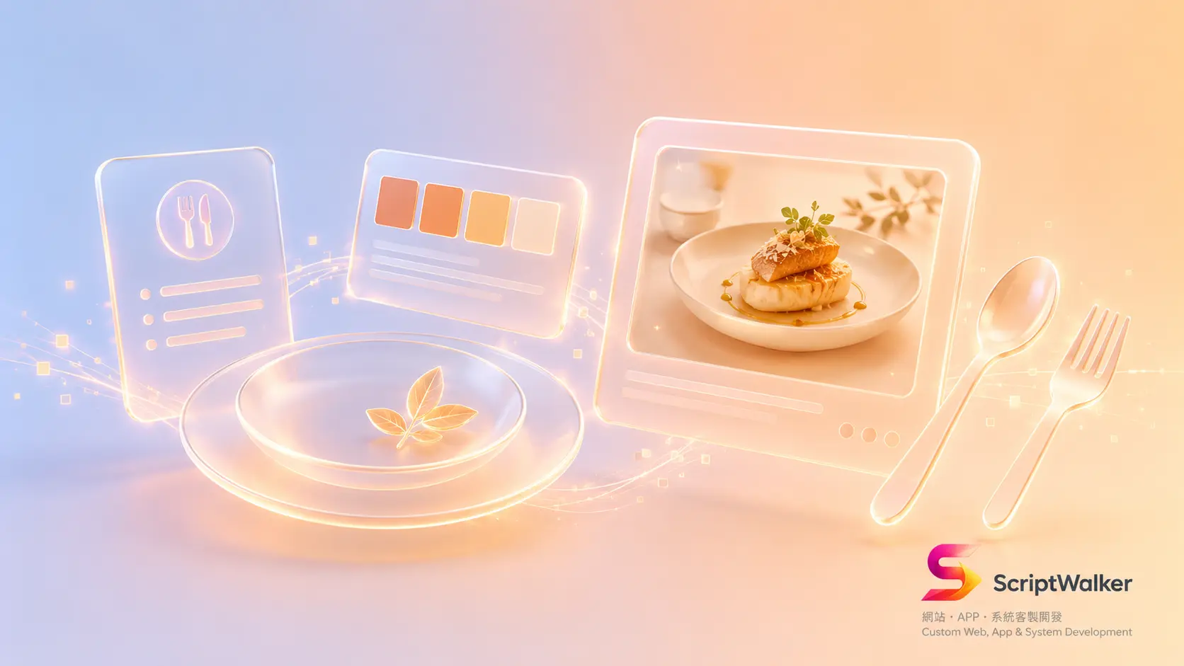
An F&B brand website has one unusual job: to make people hungry on a screen. Only when a visitor's appetite stirs mid-scroll do reservations and delivery orders follow. That doesn't come from flashy effects — it comes from four elements working together (color, photography, whitespace and layout flow), each backed by measurable psychology and behavior. This piece breaks down how five real restaurant brands do it, and lays out the technical cost, SEO impact and steps to apply.
Five Real Cases: Their Design Choices
- Sweetgreen (US salad brand): A green-led palette signals freshness and health, paired with hand-drawn ingredient illustrations and a custom SweetSans typeface. Real food photography is reserved for the menu and ordering flow rather than a giant hero — the modern "illustration for brand, photography for conversion" playbook.
- Chipotle: High-contrast product-hero photography on kraft-paper brown with red accents, driving a flow straight to ordering. With digital transactions above 60%, it's photography-as-conversion at scale.
- Nando's: The peri-peri flame red-orange anchors the brand, joined by an African-pattern library and the hand-drawn Nando's Hand font — turning "hot, spicy, energetic" into a visual system.
- Dishoom (UK Bombay café): A vintage cinema-poster visual language and warm nostalgic tones make the site feel like stepping into an old Irani café — emotion first.
- Ottolenghi: A paper-cut illustration system and the Riforma typeface build a warm Mediterranean tone, proving fine dining can convey appetite without wall-to-wall food photos.
The Logic Behind the Design
Warm colors stimulating appetite has a physiological basis: red raises heart rate and blood pressure, creating mild arousal that primes the body to act — which is why nearly every fast-food logo uses red and yellow. Lighting works the same way — an NCBI study on lighting color and eating willingness found the most positive emotion and highest appetite under 2700K warm white light, while blue light suppressed it. So warm photo lighting, backgrounds and accents on F&B sites aren't just taste — they replicate the "I want to eat" environment. A single high-contrast, clean-background food close-up as the hero places the strongest trigger at the eye's first landing point.
Technical Cost and Constraints
The price of appetite appeal is almost entirely paid in big images. An uncompressed hero can be 2–5MB and directly drags down Largest Contentful Paint (LCP) — Google recommends 75% of loads finish within 2.5 seconds, and the hero is often the LCP element itself. In practice: WebP/AVIF typically cuts 50–70% of file size, and adding fetchpriority="high" to the hero helps (Google Flights shaved 700ms of LCP this way). On effort, an F&B homepage with a photography guide, responsive cropping and performance tuning runs roughly 12–20 front-end hours; shoots and illustration are extra. Skip this and both SEO and mobile conversion get eaten by slow loads.
Industries That Fit vs Those That Shouldn't
| Strong appetite visuals fit | Should hold back instead |
|---|---|
| Restaurants, cafés, bakeries, delivery, food e-commerce, beverage brands | Medical clinics, legal/accounting, B2B SaaS, finance, government and utility sites |
| Goal: spark impulse, drive orders and reservations | Goal: build trust, reduce anxiety, present clear information |
For the latter, warm hero images and emotive photography dilute professionalism and readability; lead with whitespace, information hierarchy and a calm palette.
How to Apply It to Your Site
- Step 1: Set the palette. Pick one warm hue (red, orange or amber) as an accent over a neutral base — avoid a fully saturated page that causes fatigue.
- Step 2: Shoot a hero set. Use roughly 2700K warm light, clean backgrounds and high contrast for 3–5 signature dishes, replacing stock photos.
- Step 3: Build the hierarchy. Fix the above-the-fold order as food photo → one-line description → action button, so the eye follows the flow.
- Step 4: Let it breathe. Leave generous spacing between menu items and images so each dish is seen on its own, not crammed together.
- Step 5: Compress and optimize. Convert the hero to WebP/AVIF, add fetchpriority, lazy-load the rest, and keep LCP under 2.5 seconds.
Common Mistakes × How to Avoid Them
- Mistake 1: Flooding the page with saturated warm color. An all-red page fatigues the eye and looks cheap — use warm tones as accents, not the base.
- Mistake 2: Passing stock photos off as your dishes. Visitors see through it instantly and trust drops. Shoot three real dishes first.
- Mistake 3: Sacrificing speed for looks. A 4MB hero taking 5 seconds on mobile loses people before appetite even kicks in. Pass LCP first, then chase polish.
Extended Resources
- Coolors: Quickly generate and test warm palettes, locking a base color to fine-tune.
- Squoosh: Google's browser image compressor — convert to WebP/AVIF and compare quality against file size in real time.
- PageSpeed Insights: Check whether your hero is dragging down LCP and overall Core Web Vitals.
FAQ
Q1: Do I have to use red? Won't other colors work?
Not necessarily. Red, orange and yellow drive appetite hardest, but green signals freshness and health (as with Sweetgreen). The key is matching brand positioning and keeping photo lighting warm — not forcing red on.
Q2: Should the homepage carry a big food photo at all?
It depends on the goal. To push order conversion, use a high-contrast food close-up; if the brand leans on craft, you can do a Ottolenghi and use illustration on the homepage, saving photography for the menu page.
Q3: Do big images hurt SEO?
Yes, if unoptimized. An uncompressed hero raises LCP and hurts Core Web Vitals and mobile ranking. Convert to WebP/AVIF, add fetchpriority and lazy-load to have both.
Q4: On a small budget, what comes first?
Shoot a set of real signature dishes under warm light — the highest-ROI move. Color and layout flow can be refined step by step with ready-made tools and templates.
Make Your F&B Site Actually Make People Hungry
Appetite appeal isn't mysticism — it's the combined technique of color, photography, whitespace and layout flow plus performance tuning. ScriptWalker builds F&B brand websites and apps on Laravel + Flutter that balance craft and speed, covering photography direction, color systems and LCP optimization end to end. If you want a site that not only looks good but brings in reservations and orders, let's talk.
- Email: [email protected]
- Phone: 0916-224-047
- LINE: @ufv9089p